一行CSS实现各种响应式元素 – Fluidity
FLUIDITY是一个极微小的CSS样式表,压缩版只有一行代码,大小只有115个字节,它能实现图像、文本、Canvas、Table表格以及iFrame框架的响应式功能。好用且实用!
这个响应式非常适合用于一般企业站或文章内容上,如果需要表单、layout等支持就需要那些响应式框架了,但那些文件实现太大了,如Bootstrap就已经100KB+了,所以我觉得够用就好,下面一起来看看介绍。
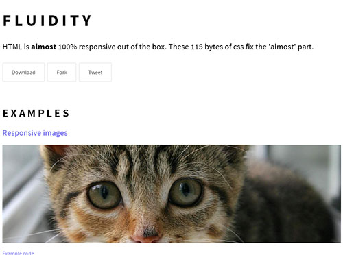
FLUIDITY
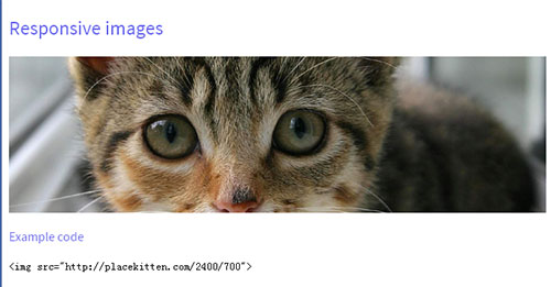
响应式图像
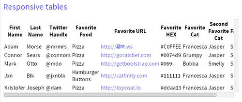
响应式Table
响应式Canvas元素

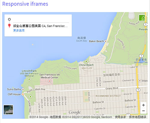
响应式Iframe框架
使用方法
使用这个CSS是十分简单的。
STEP1:引入CSS文件
在head内嵌入fluidity的css文件。
<link rel="stylesheet" href="css/fluidity.min.css">
STEP2:HTML代码
响应式图像代码
<img src="image.png">
响应式table代码
<div class="overflow-container">
  <table>
    <!-- table 内容 -->
  </table>
</div>
响应式iframe框架代码
<iframe src="https://www.google.com/maps/embed?地图代码" width="100%" height="450" frameborder="0" style="border:0"></iframe>
Fluidity.Css
下面我们也来看看fluidity.css里面的内容,其实就是2行css样式,十分简单吧?
 Responsive Utilities

*/
img, canvas, iframe, video, svg { max-width: 100%; }

/* Wrap tables or pre elements in a div with this class */
.overflow-container { overflow-y: scroll; }

/* Aspect ratios for media objects i.e canvas, iframe, video, svg etc. Defaults to 16x9
*/
.aspect-ratio { height: 0; padding-top: 56.25%; position: relative; }

.aspect-ratio--object { bottom: 0; height: 100%; left: 0; position: absolute; right: 0; top: 0; width: 100%; z-index: 100; }
传送门:在线预览 | 下载地址(Github)